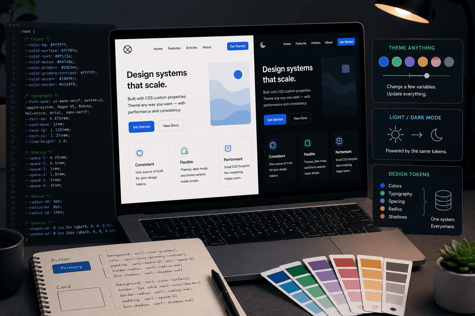
CSS Custom Properties in Production: Building a Theme Without a CSS Framework
A theme toggle does not need a design-token build pipeline to feel solid. A small set of CSS custom properties, defined once and flipped at the html element, can carry an entire site through light and dark mode with very little JavaScript involved.
TL;DR / Written for skimmers
Naming a variable --ink instead of --black, or --bg instead of --white, is what makes the same variable usable in both themes. The name describes the role the color plays in the interface, not a specific hex value, so it can point to a different color per theme without renaming anything that uses it. Defining the default values on :root and the overrides on a class like .dark keeps the source of truth in one file. Every component then just reads var(--ink) or var(--bg) and never needs to know which theme is active. The common failure mode is a flash of the light theme before JavaScript applies the saved preference. Reading the stored theme and applying the class before the first paint, typically with a small inline script or a server-aware check, avoids that flicker. CSS variables update instantly across the whole page when the class on html changes, with no re-render and no JavaScript theme object to thread through every styled component.
Pick semantic names, not color names
Naming a variable --ink instead of --black, or --bg instead of --white, is what makes the same variable usable in both themes. The name describes the role the color plays in the interface, not a specific hex value, so it can point to a different color per theme without renaming anything that uses it.
A small core set is usually enough: a background, a foreground, a muted text color, a border or line color, and an accent. Most interfaces do not need more than five or six theme variables to look intentional.
Where to define and where to override
Defining the default values on :root and the overrides on a class like .dark keeps the source of truth in one file. Every component then just reads var(--ink) or var(--bg) and never needs to know which theme is active.
This separation also makes it trivial to add a third theme later, like a high-contrast mode, without touching component code at all. Only the variable definitions change.
Switching themes without a flash of the wrong color
The common failure mode is a flash of the light theme before JavaScript applies the saved preference. Reading the stored theme and applying the class before the first paint, typically with a small inline script or a server-aware check, avoids that flicker.
Persisting the choice in localStorage and respecting prefers-color-scheme as a fallback covers both the user who picked a theme explicitly and the one who never thought about it.
When custom properties beat a CSS-in-JS theme object
CSS variables update instantly across the whole page when the class on html changes, with no re-render and no JavaScript theme object to thread through every styled component.
That makes them a better fit than most CSS-in-JS theming approaches for the specific job of light and dark mode, even in a project that otherwise uses Tailwind or another utility framework on top.